How might we turn USER feedback into
powerful analytical data?
Role
Interaction Design, User
Research
Timeline
Freelancing For BothersMe
The Context
I was approached for the project by the BothersMe founder, when the company had nothing more than its business concept, and was looking for a way of promoting it in the market. BothersMe needed some design help to create a fresh brand identity, as well as help creating their very first public website and mobile apps for both iOS and Android from the ground up.
Challenge
At the time, there were approximately 13 competitors on the market with similar business ideas, though 70% of them had only a web platform.
That caused difficulties for users who wanted to be able to report problems on the go.
Our goal was thus not only to deliver a product that was easy to use, but also to clearly communicate the value of BothersMe in order to make it stand out.
Based on our agreement, my deliverables included: designing the company’s first website and IOS and Android mobile apps;
designing a plugin;
creating a brand identity.
The Design Process
BothersMe had carried out a competitive analysis, which they shared with me.
I started out by identifying their target audience and conducting user sentiment analysis.
The research findings were reflected in the creative brief. That set the tone for development of the brand identity and the choice of the application platform.
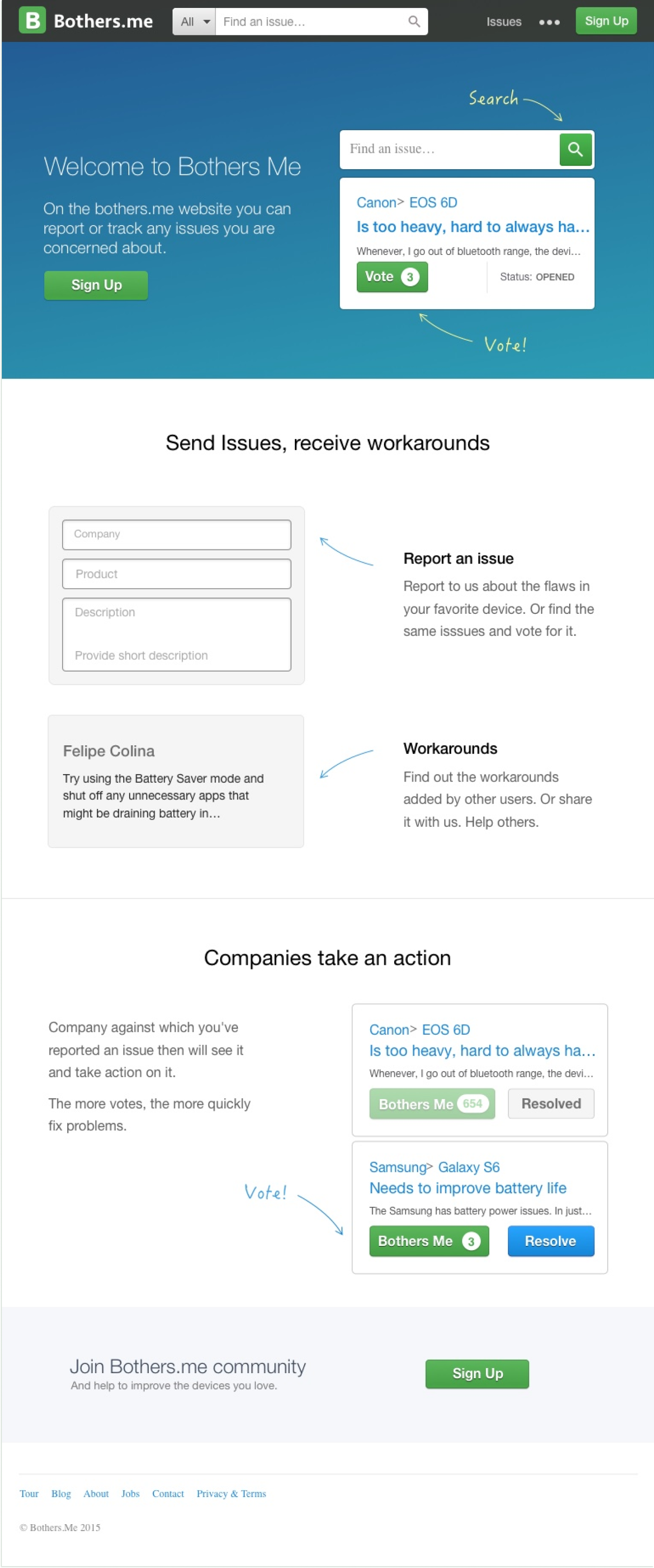
Public Website
I then started working on the public website and the plugin.
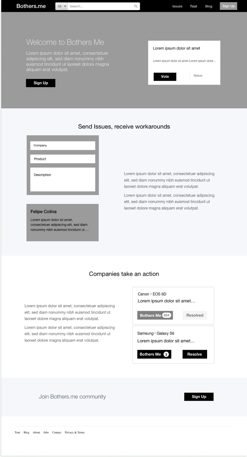
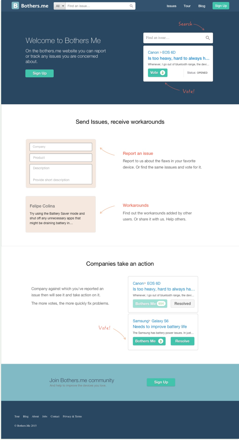
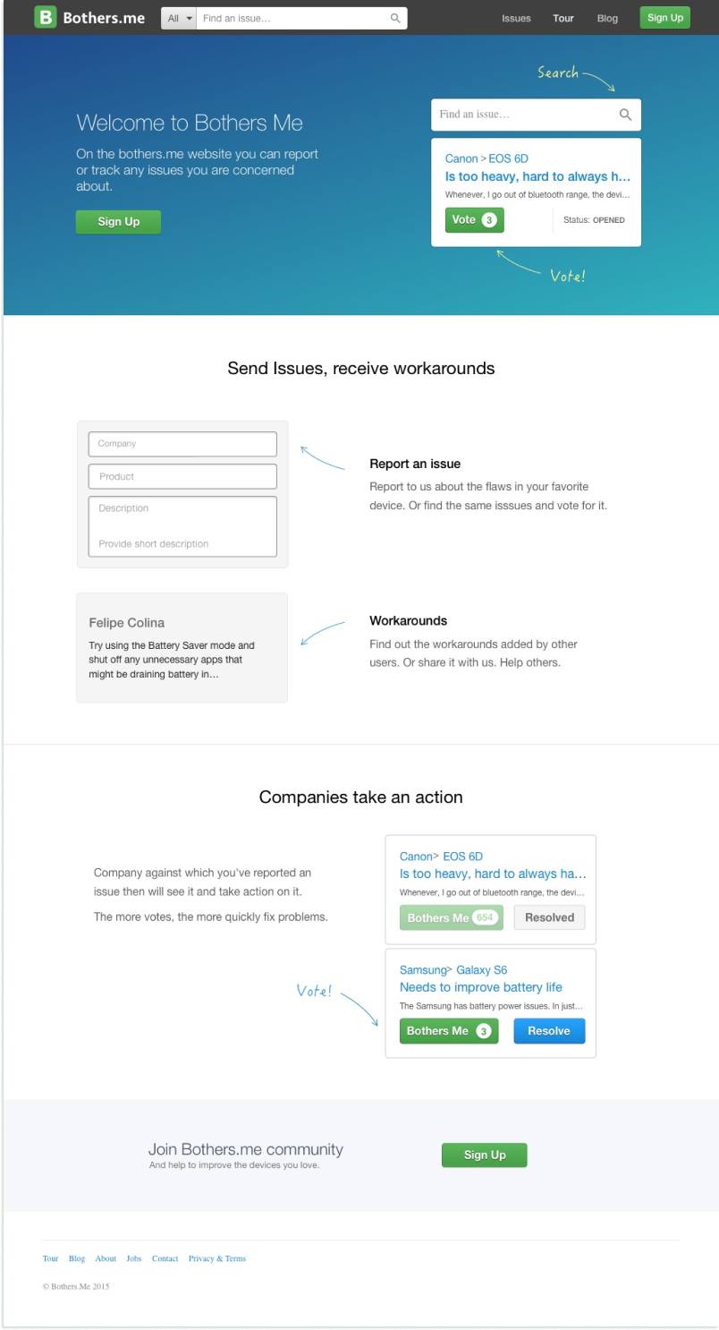
I started out by creating the architecture and sketches, then made iterative wireframes and visual mockups.
How the tour page evolved over time:
Plugin
BothersMe planned to generate revenue by selling plugins to commercial companies. Here is a plugin prototype I designed:
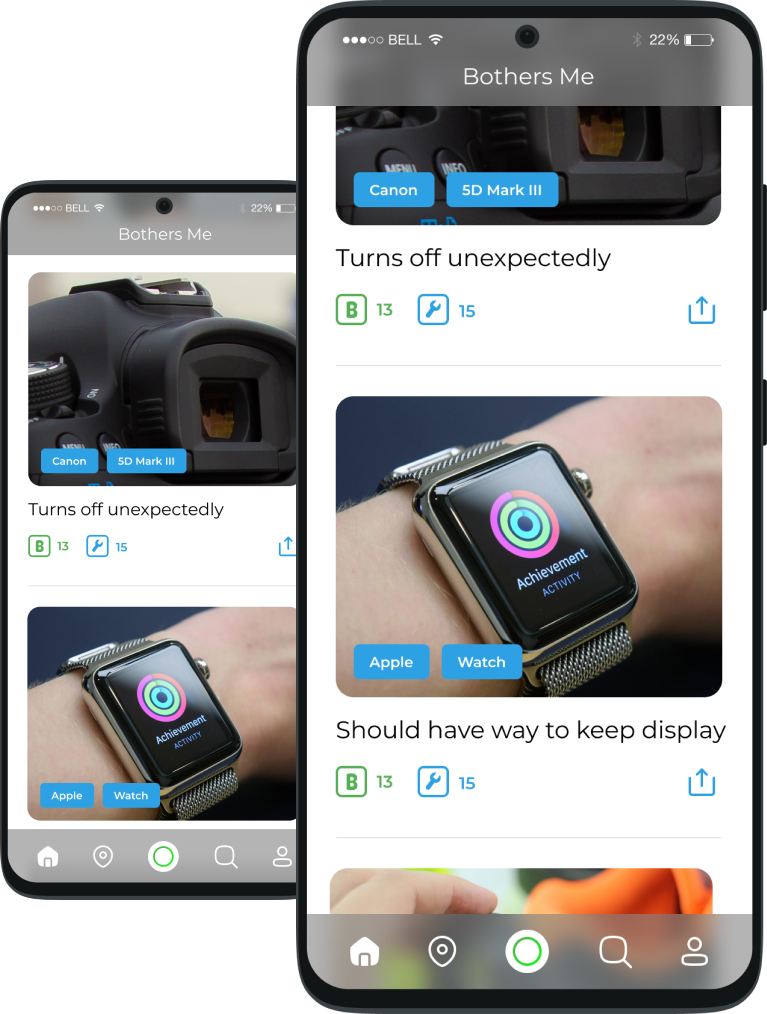
Mobile App
There were difficulties for users who wanted to be able to report problems on the go.
Our goal was thus not only to deliver a product that was easy to use, but also to clearly communicate the value of BothersMe, in order to make it stand out.
find an issue and vote on it
report an issue (with an optional image)
find issues related to the business
sort issues by number of votes
sort issues by number of votes / views
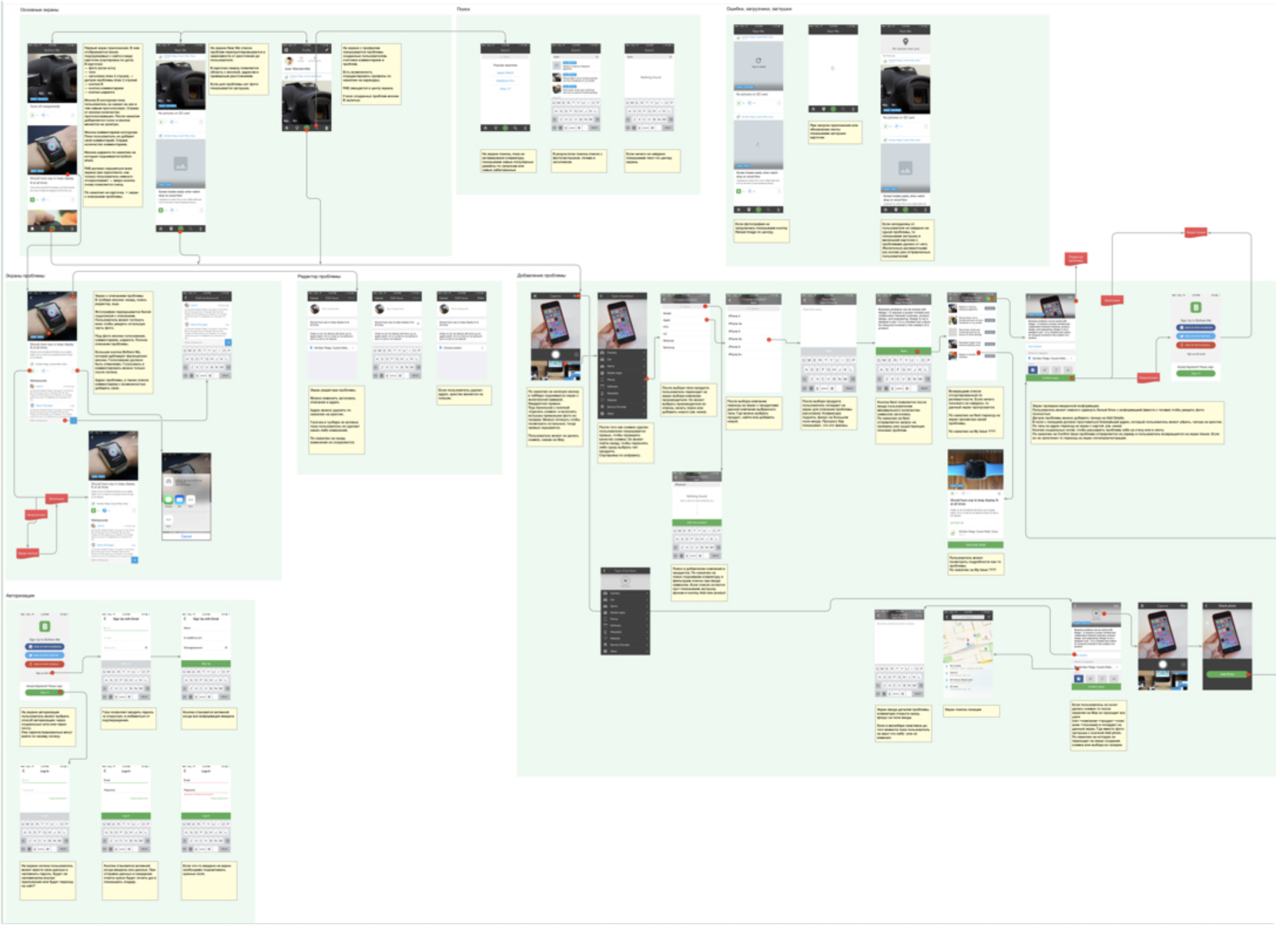
The next step was to visualize the use cases step-by-step, by creating a user flow.
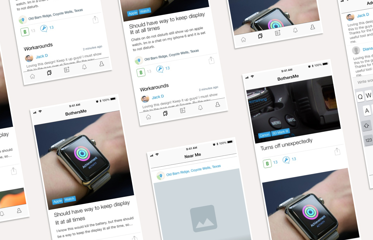
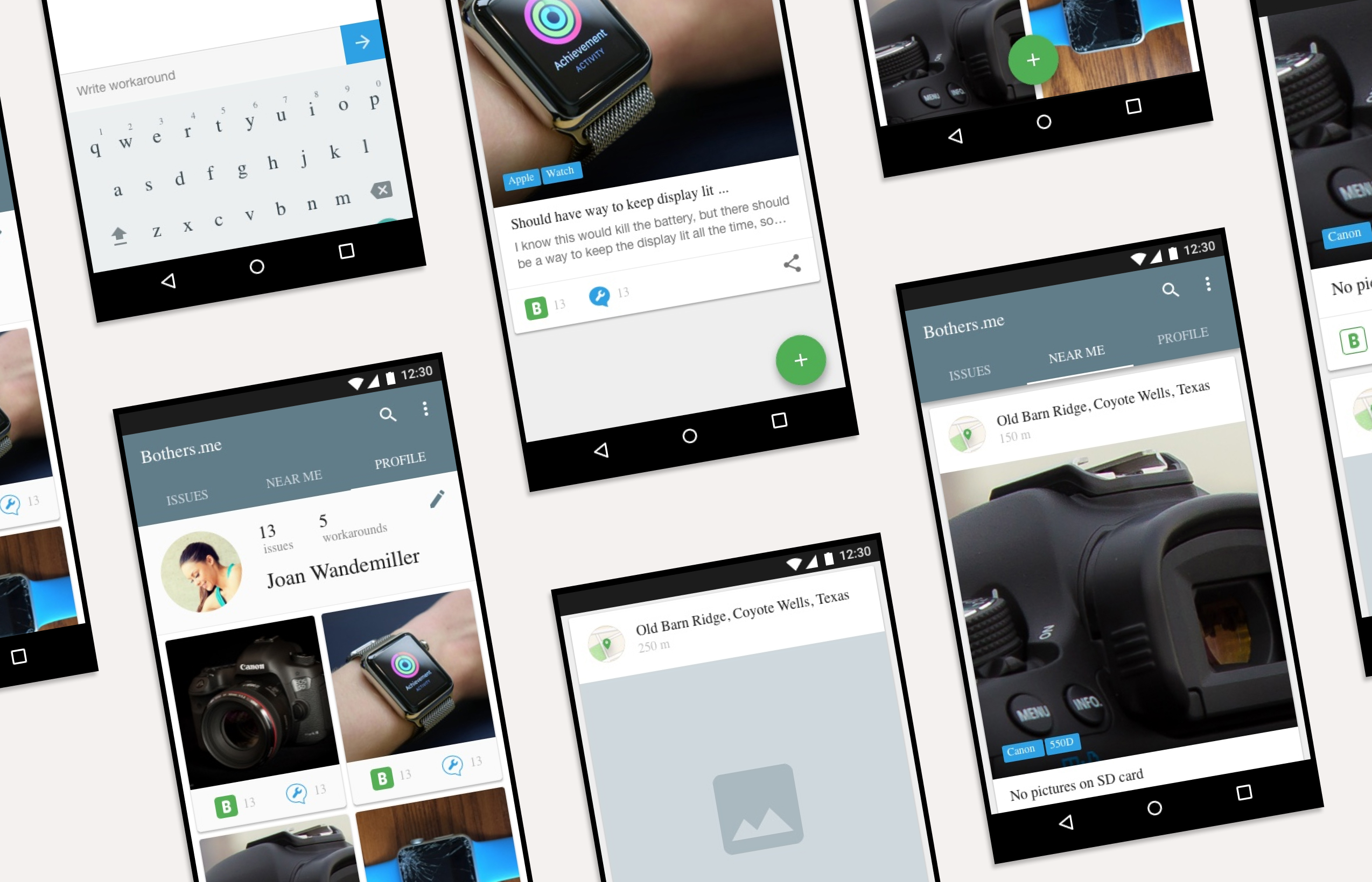
After that, I drafted low-fidelity wireframes. Finally, I converted them into high fidelity mock-ups, including all functional details and the brand identity.
CREATING THE IDENTITY
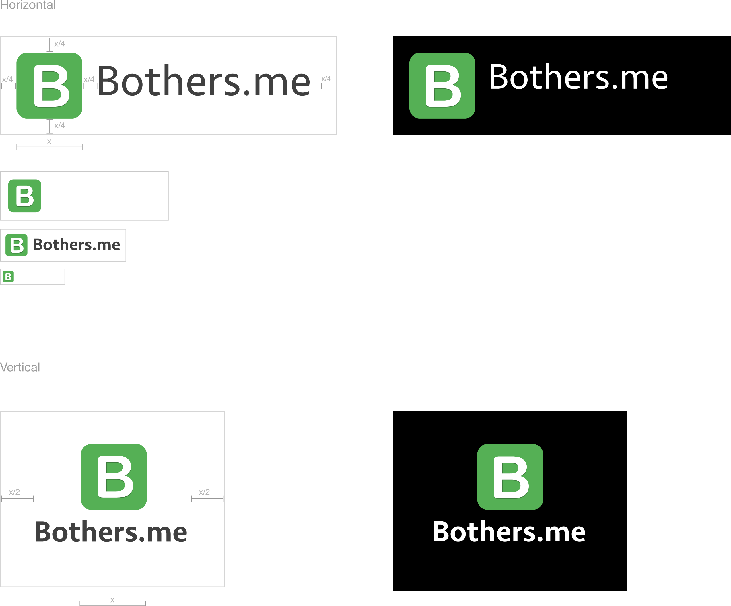
Based on the creative brief and the company values we identified, we steered the BM brand in a minimalist, technological direction.
THE RESULT AND REFLECTION
The website and mobile apps’ designs have been praised in reviews. They have been described as “simple”, “straightforward”, and “clean and uncluttered”. Most importantly, they didn’t confuse users.
Users noted that they felt secure in relying on the speed and convenience of BothersMe, rather than contacting companies directly, because companies don’t pay much attention to small amounts of feedback.
This project posed an interesting challenge: making the right compromises to best match the interests of commercial companies and individual users.
They have been described as "simple", "straightforward", and "clean and uncluttered"
Check out the BothersMe responsive website mockups (company faced)
Check out the BothersMe responsive website mockups (user faced)
