How might we improve custom production by connecting artists and manufacturers?
Role
Mobile And Web Design,
Design Strategy, User Research
Timeline
2017 - 2018, working
corporate in-house at Vida
The Context
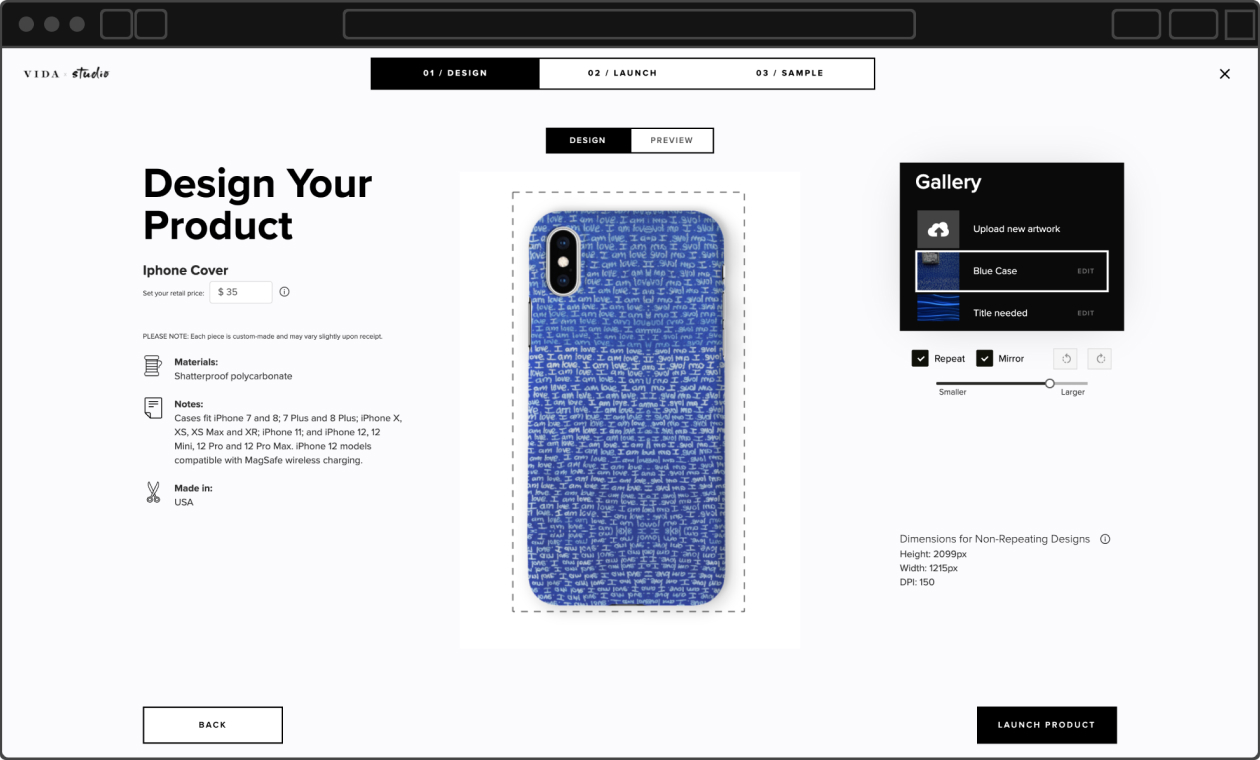
In early 2015, VIDA developed Vida Studio as a platform to help artists create and launch their designs. For most of Vida’s history, launching new products was managed through a desktop platform. The design and technology behind it hadn’t aged well. We launched Vida mobile Studio in December 2017.
Vida Studio’s initial release focused on establishing a product foundation, but was missing functionality and simplicity that was essential for our diverse user base. The current information architecture was poorly organized, which led users to perform repetitive steps.There was also overcomplicated UI that needed simplification or rethought to improve user experience.
OBJECTIVE
The original premise was “simple”: launch your product with one click. Make it fast and easy to use for everyone, everywhere. Give artists more control over their products and store. Create a platform for deeper engagement.
The original premise was «simple»: launch your product with one click.
Research
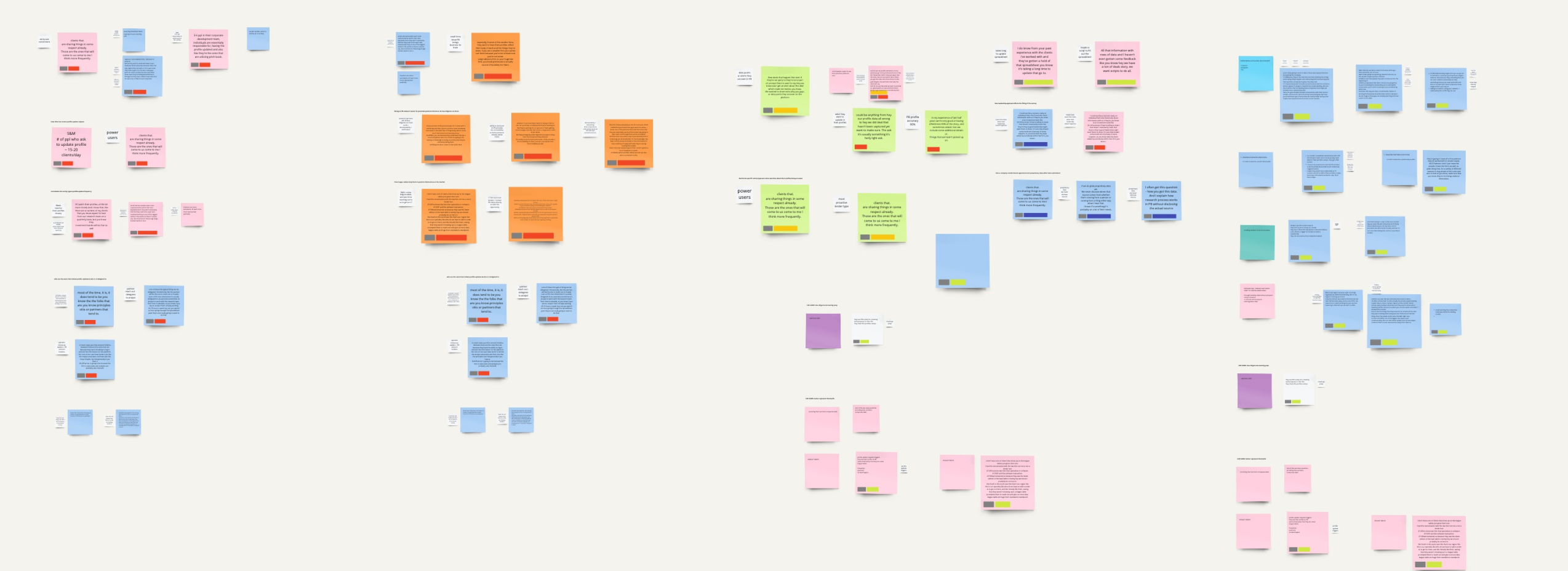
The first step was to conduct guerrilla usability tests. I identified core tasks that artists complete and conducted testing with 5 participants. I asked each individual to perform tasks related to single and multi-product launch, and asked that they verbalize their thoughts throughout the test.
From the research, we came away with some insights — most of which I can’t share publicly. However, some specific complaints about the interface were that:
«Once the artwork was uploaded, there were no easy links to find my art, there was no option to delete it»
«By the time my artwork was approved (which took two days) the special was no longer valid»
Based on my usability testing, I created task flows. This helped me better understand customers’ situations, motivations and expected outcomes.The next step was to review and sort the reactions and feedback I received from the users.
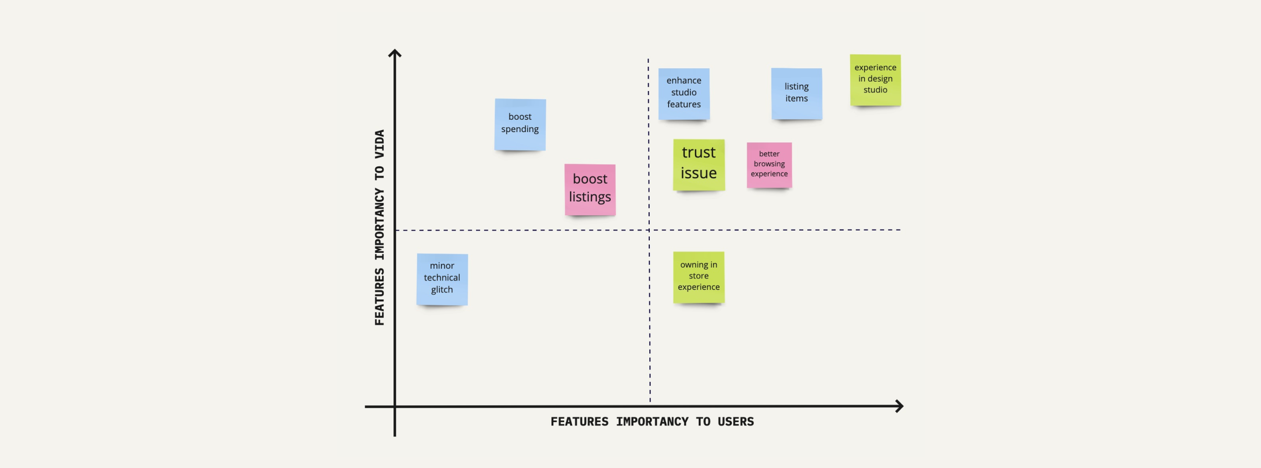
Next, I categorized the pain points by business and users importance.
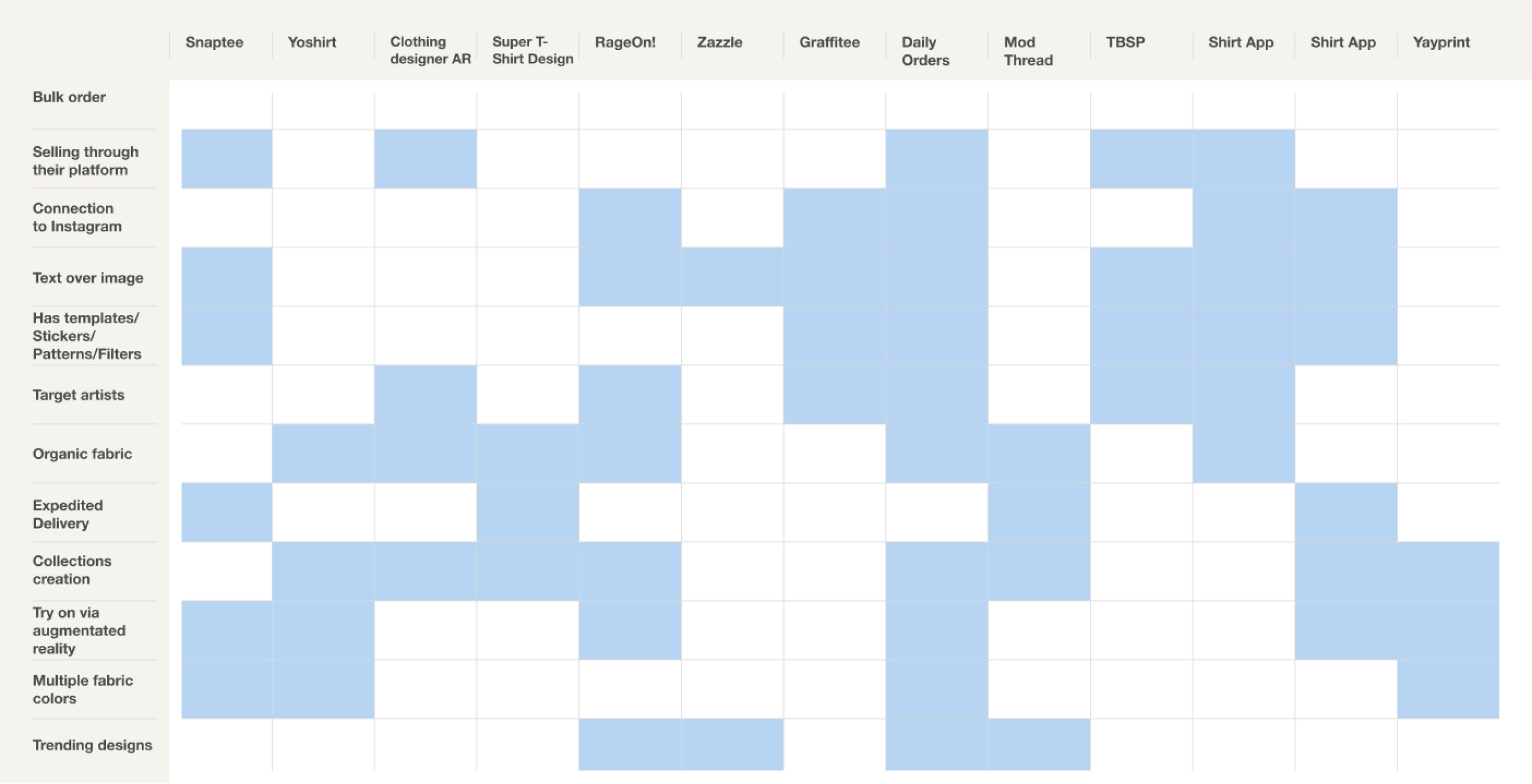
COMPETITIVE ANALYSIS
There are 18 services that offer apparel production based on submitted design. Surveying each, we were able to understand their core features.
DESIGN
PAIN POINT 1
There is only a desktop version of VIDA Design Studio.
SOLUTION
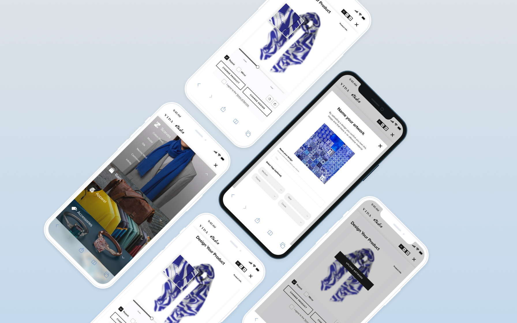
To give artists the flexibility to create and manage their collection from anywhere at anytime, we created the VIDA mobile Studio.
PAIN POINT 2
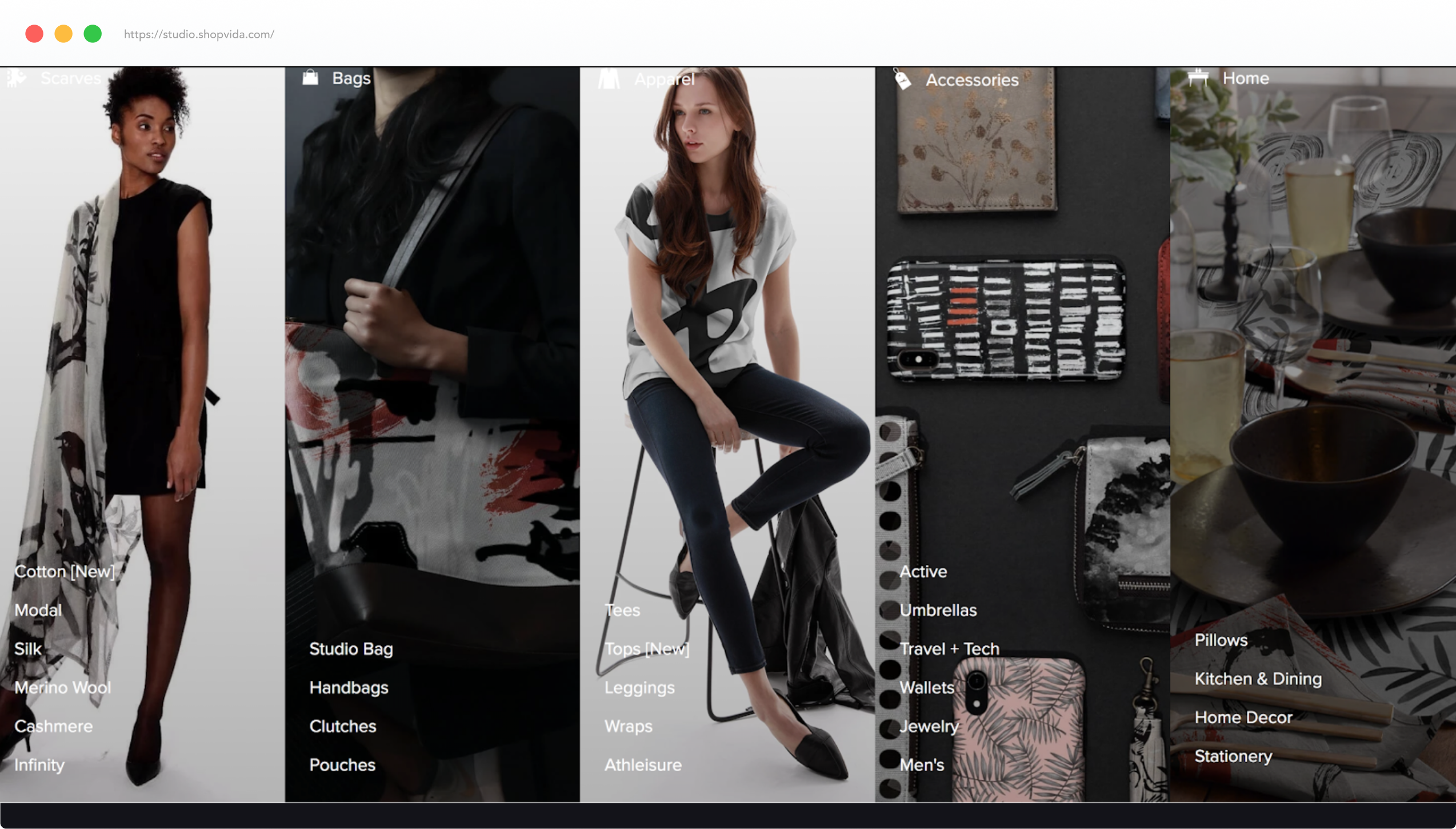
Creating a multi-product collection was very time consuming (already in 2017 VIDA was launching a new product category every month).
SOLUTION
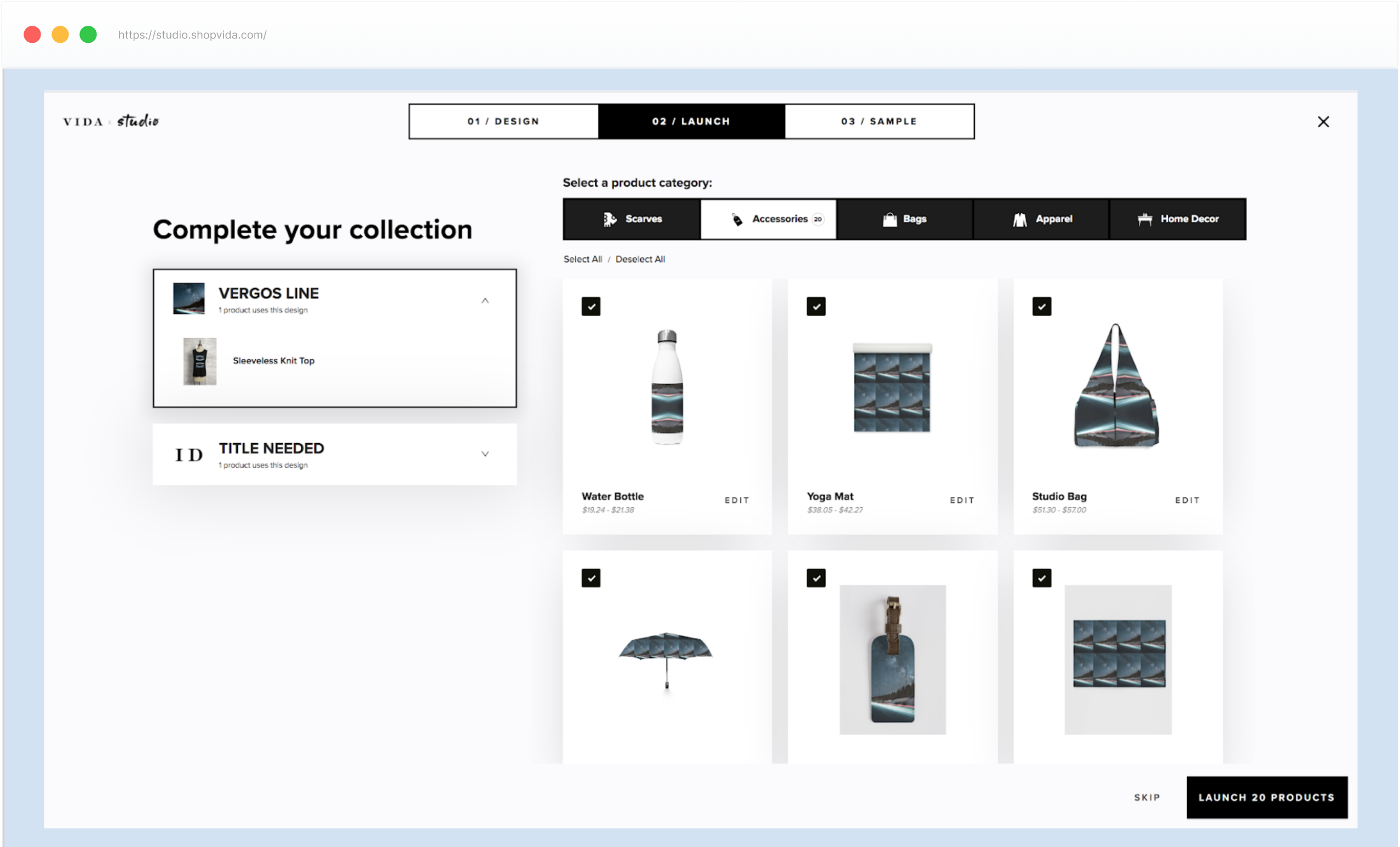
Altered the flow so that it’d now let them launch multiple products featuring the same design in just one click. We added a new step where artists were able to select or deselect which product they’d like to launch within one artwork line (every new product would feature the same design). If they didn’t like the way artwork was automatically laid out on a product, they could individually edit the design before launching all pieces in one line.
PAIN POINT 3
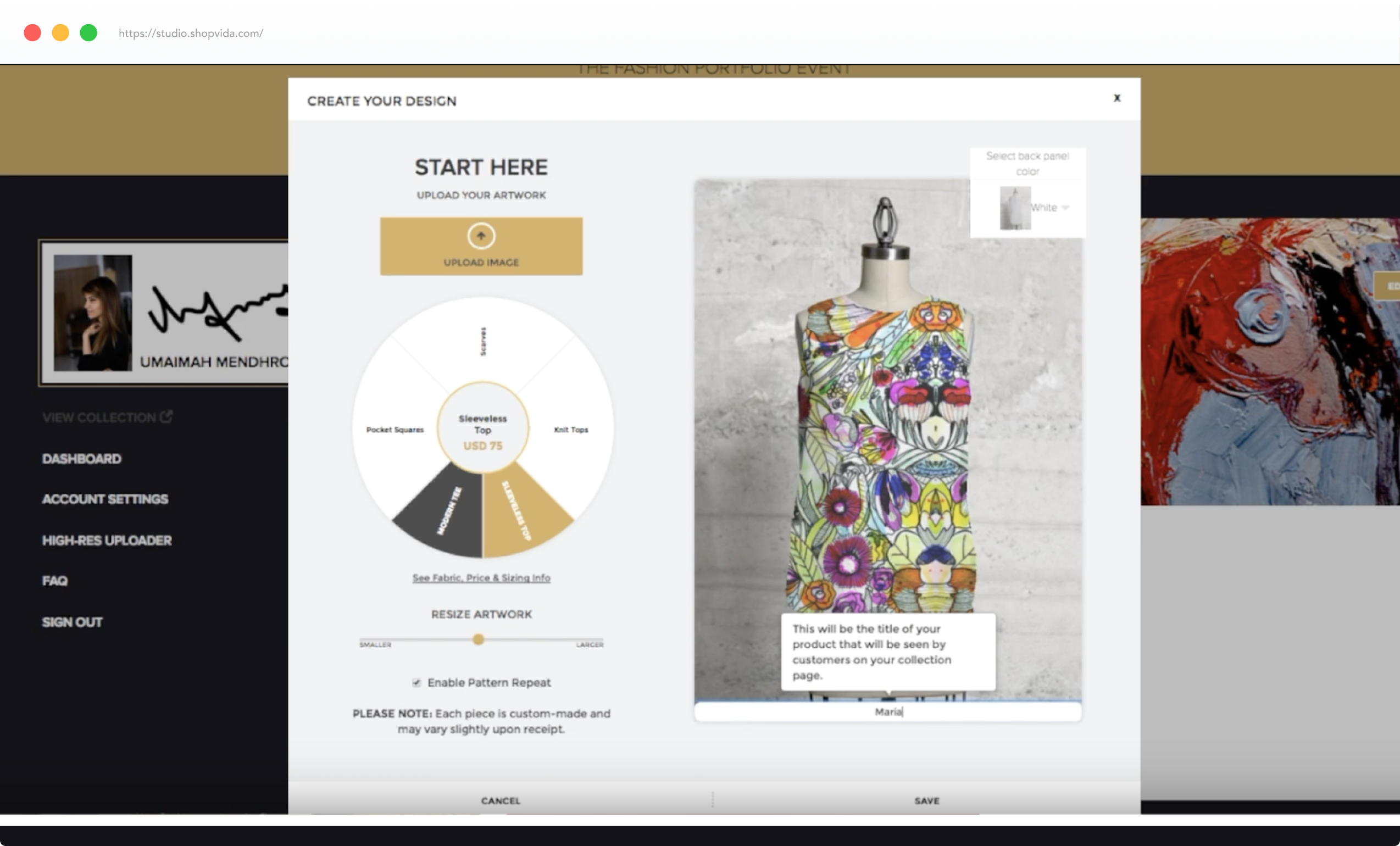
Product selector. The product portfolio kept growing, adding further apparel and accessories. Whenever we needed to add something to the product wheel, the only question our team kept asking was: “But, will it fit?”. In my mind, this made no sense at all. The selection wheel was actually limiting the growth of product range.
SOLUTION
Undertook a couple of product meetings to make the decision of switching to a horizontal selector.
PROCESS & VALIDATION
I created a low-fidelity prototype. I reviewed the static mockups internally with 3 test participants before going into the next round of iterations.

HIGH-FIDELITY PROTOTYPING
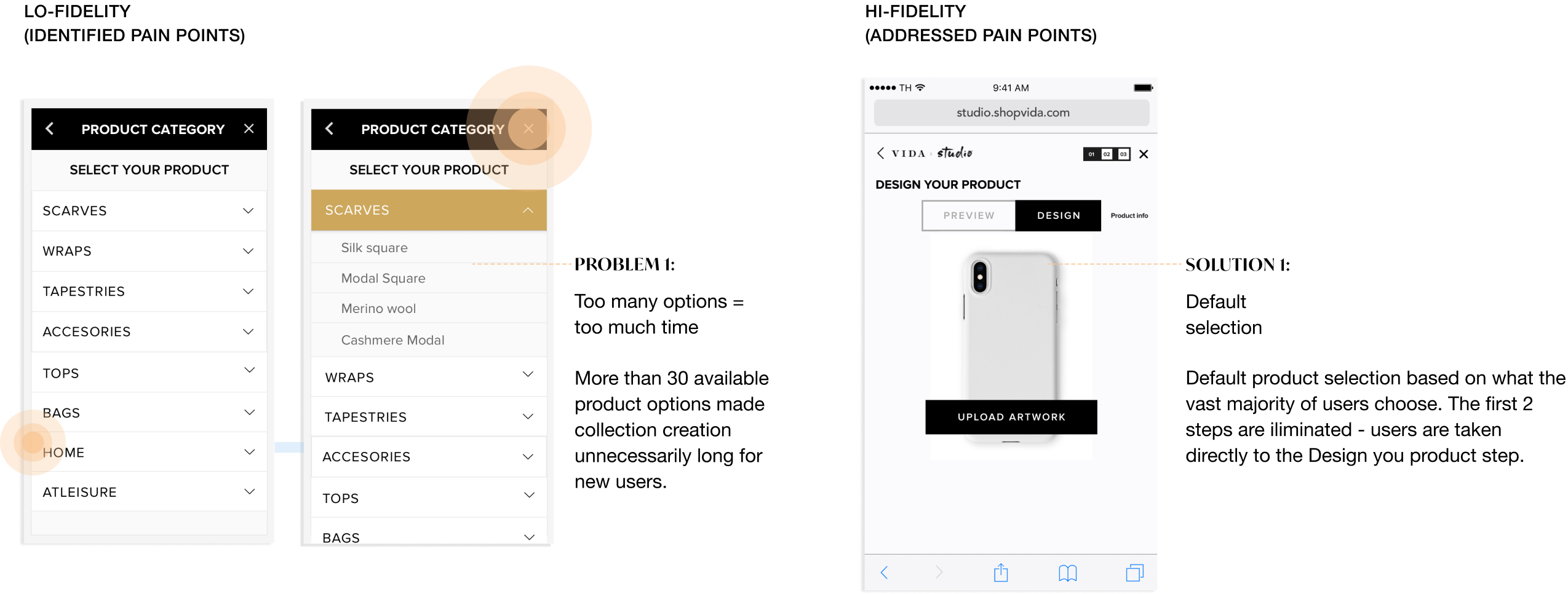
To solve the pain points identified in low-fidelity validation, we went back to whiteboarding and also looked at patterns in existing products. Here are major pain points identified in low-fidelity and addressed in hi-fidelity:
MAIN LESSONS
There is only one way to eat an elephant: a bite at a time. Convert your elephant into MVP bites.
You need a map to navigate through a complex landscape of project development. Make sure to bring one.
Unconventional solutions require unconventional brains. Save them seats at the table.
Attention span is short. Reduce complex usability testing scripts.
Measuring Success
18 %
Increase in
product launch
23 %
REDUCTION IN
SUPPORT CALLS
