How might we automate complex regression testing with smarter design?
Role
Interaction design, prototyping, visual design, user research, design strategy
Timeline
2020, freelancing for Testrigor
The Context
I was approached for freelance design and consultation soon after a startup Testrigor had received their seed funding.
The client’s budget and timeline necessitated an expedited and, at times, less-than-ideal design process, done under tight constraints.
Testrigor needed critical design assistance to transition from an established product basis to an elegantly architected product on a tight deadline. How would we help Testrigor move forward on a limited budget and time?
The problem
The Testrigor team is demoing the application for me. After launching, a test run is completed within 10 minutes.
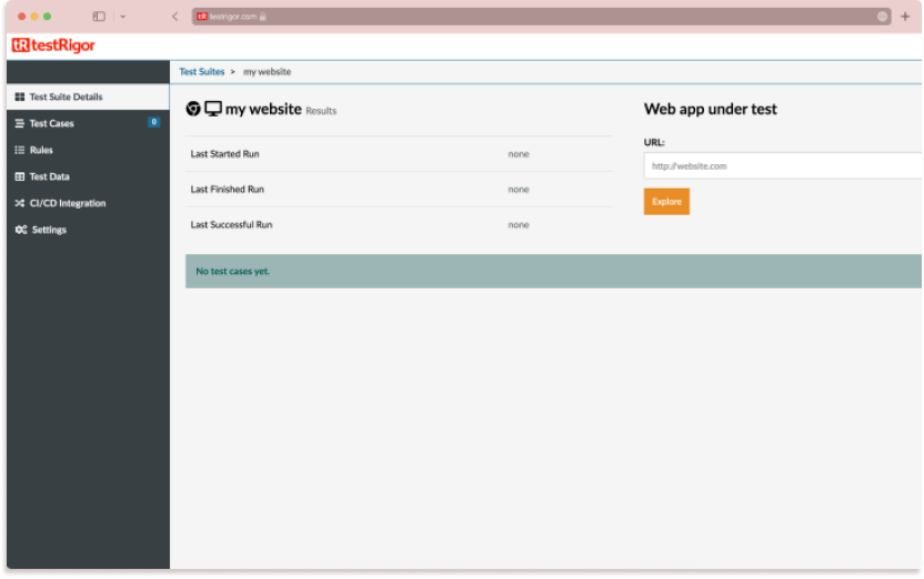
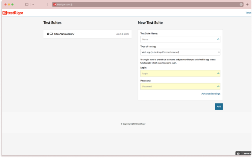
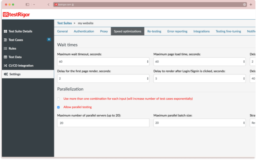
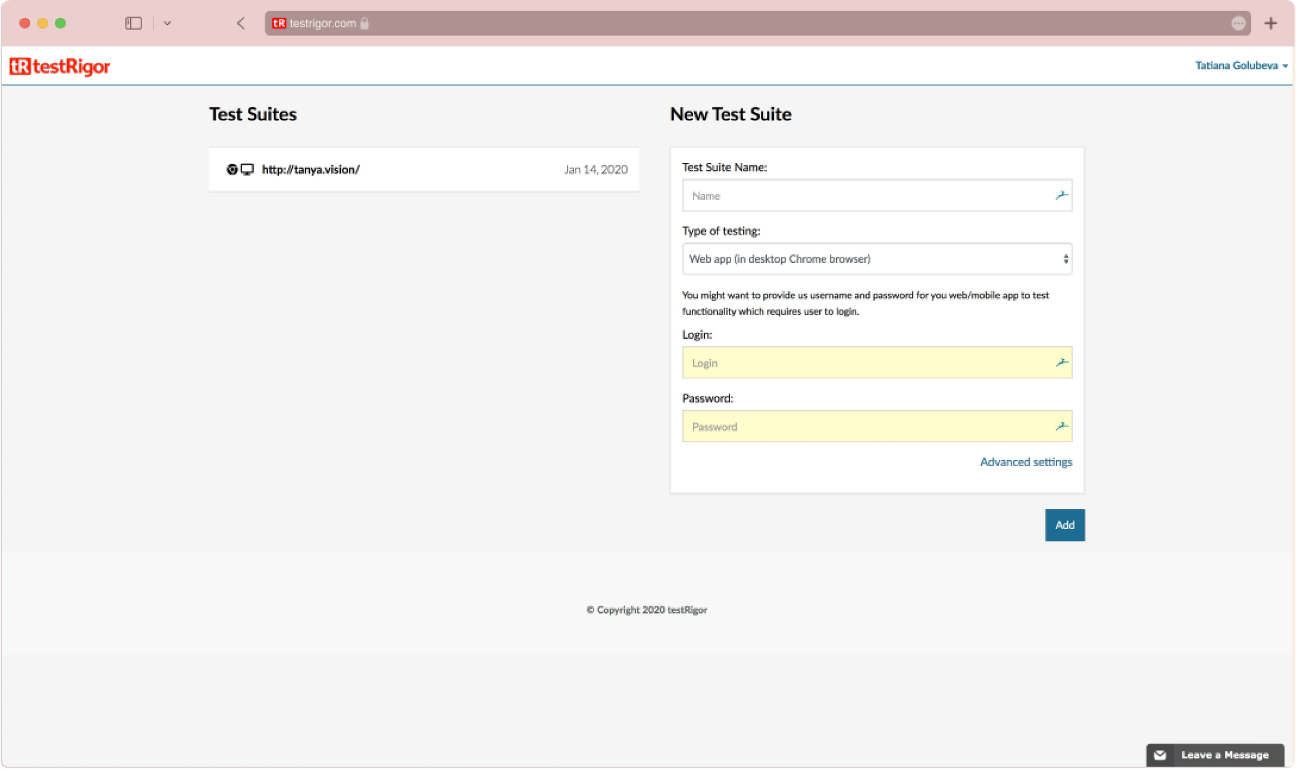
Screenshots of the current Testrigor software
“Other companies’ software regression testing platforms are too complicated,” says Brian – Testrigor’s co-founder – as he shows me competitors and their arduous set up process. “Our product needs to stay comprehensive but simple.”
«Other companies` software regression testing platforms are too complicated. Our product needs to stay comprehensive but simple.»
The research
Throughout the process, I held many stakeholder meetings. Our initial meetings and work focused on understanding the product, its current issues, the users, and the competitive landscape.
My approach encompassed:
– Using existing and gathering additional research to understand users’ primary use cases
– Identifying flow and architecture inefficiencies based on the identified use cases in relation to the existing design
– Designing a new architecture, incorporating all current features, with efficient interaction flows based on the identified use cases
We interviewed test participants to learn about their Testrigor experience:
7 Participants (prospective customers)
60-mins Sessions
3 Approaches: Usability testing with the existing application, 5 Whys, contextual inquiry.
The research helped orient the design toward making the product users goal-oriented versus data-oriented, which set the tone for the re-architecture of Testrigor
After studying the competitors’ software, user reviews, and usability studies, it became clear certain quirks gave users frustration. In particular:
The setup process was difficult for most users to complete
The interaction of previous test runs could be unclear
The status of a test run being launched or not could be unclear
The architecture or layouts of the test run results could be confusing
The design
Pain Point 1
Not all Testrigor customers manage to complete a new test suite setup.
The setup form contains 55 fields.
Mandatory and optional fields aren’t marked or separated in a clear way.
The setup flow is a long horizontal form with the “Explore” button in the middle.
Some settings that are under “Advanced” are used frequently.
Solution
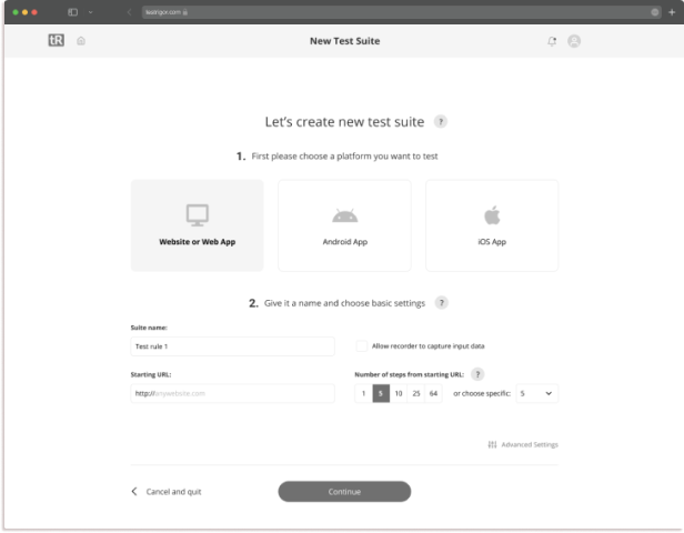
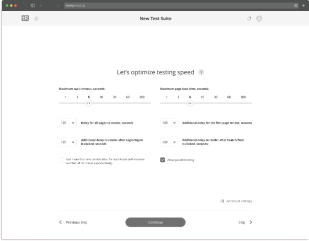
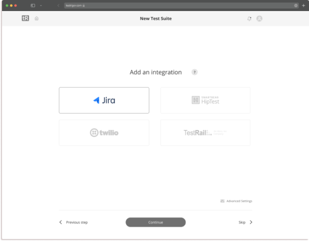
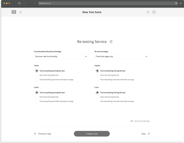
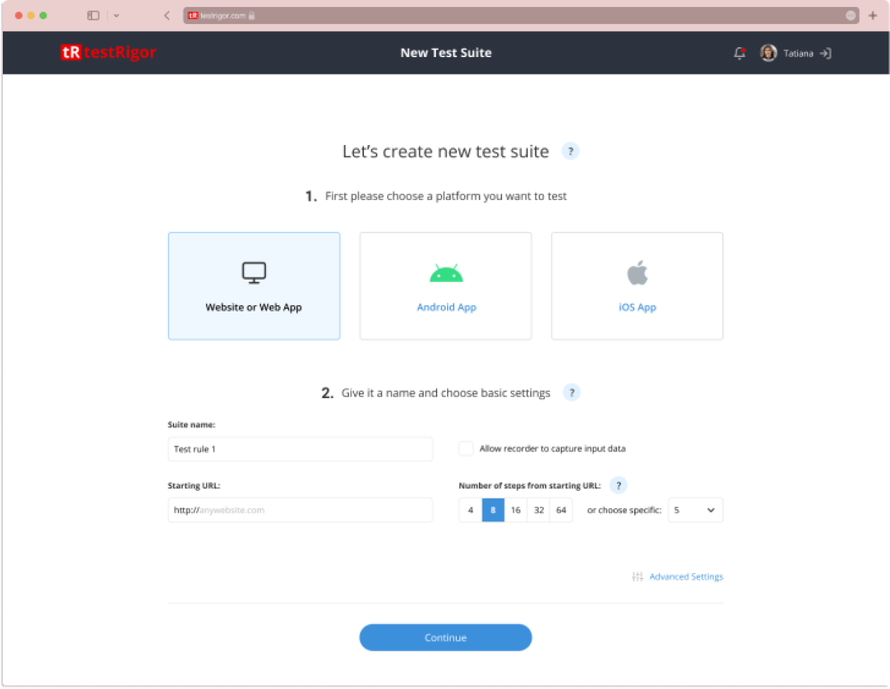
My first solution was to break the long form into logical groups. I organised the questions into 4 related groups and put each of them on a separate page. By that, I suggested progressive disclosure as the best practice for such a challenge.
The founders, though, were still leaning toward a one-page flow.
To progress the project I demonstrated to them the best practices by showing examples of similar approaches from Zendesk and Squareup.
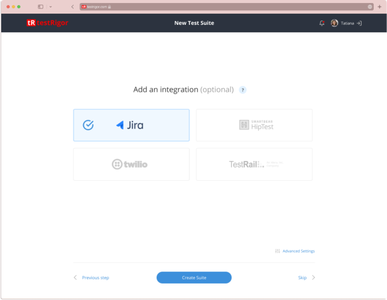
A concept of the set up process (progressive disclosure)
The usability testing of this idea showed users were either skipping most of the fields or picking some random options. We realized the overwhelm of the multi-step process that included many new terms.
Our final solution was to reduce the setup process to one page of basic settings.
PAIN POINT 2
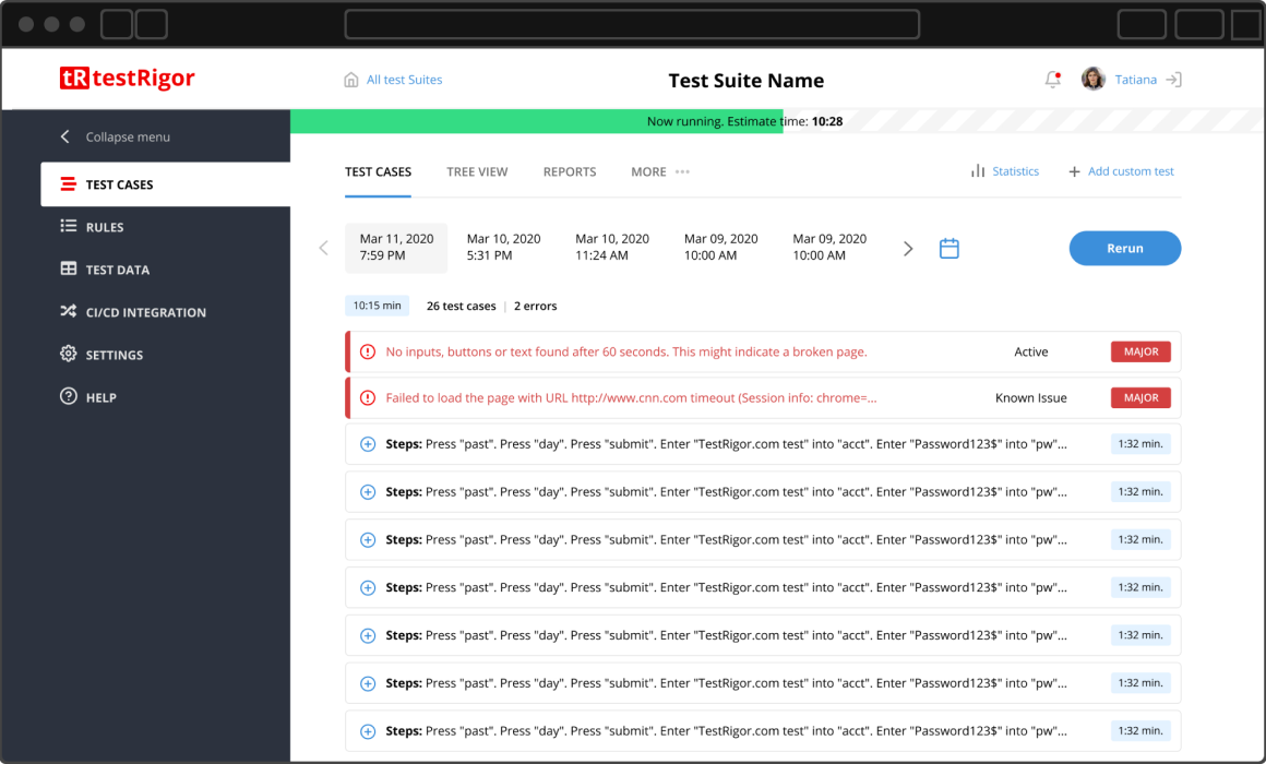
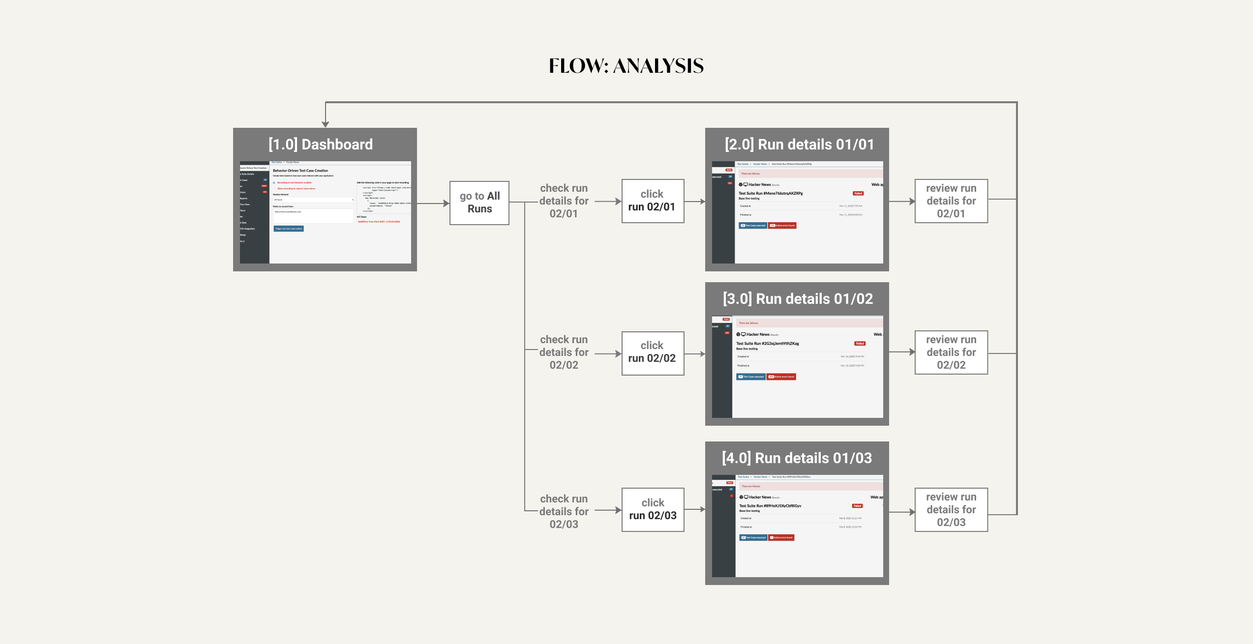
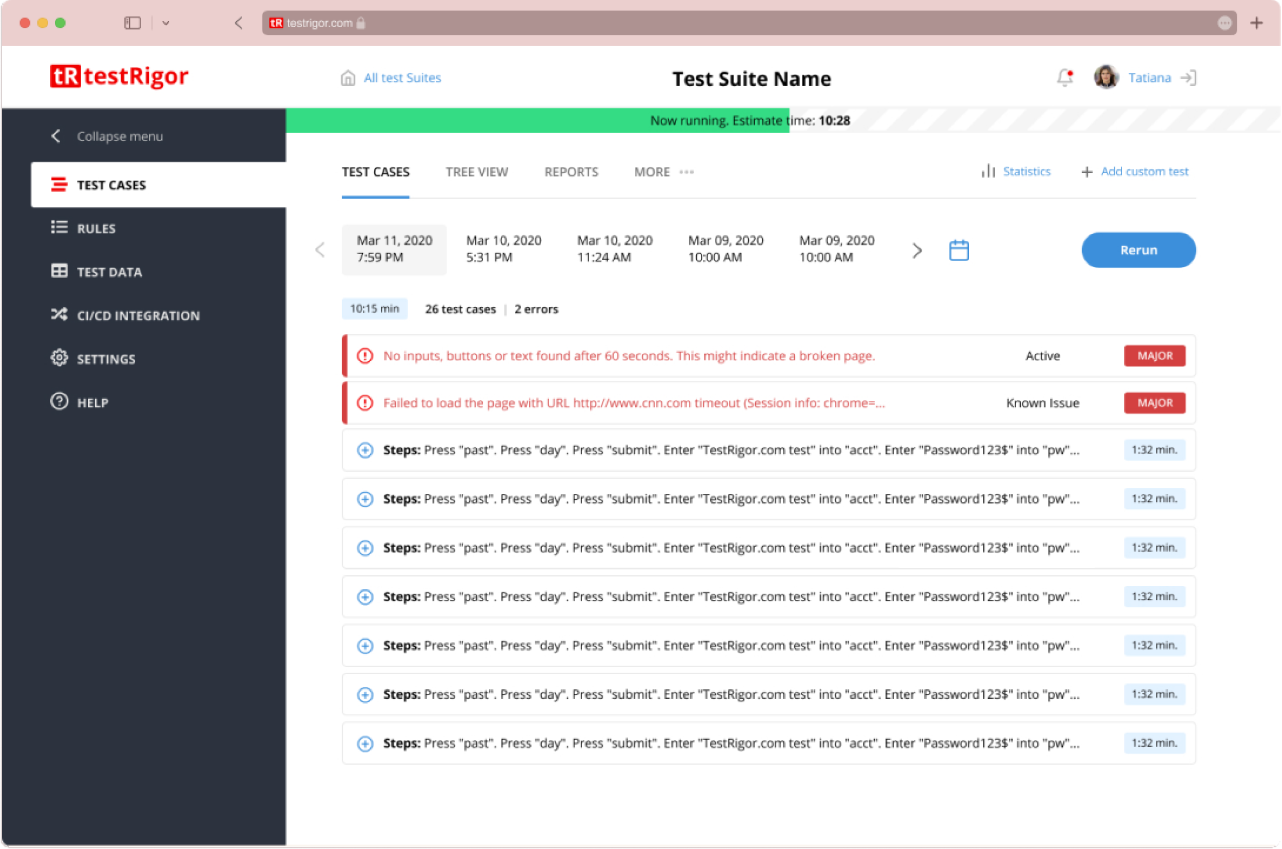
Users typically look at current and past runs together to check what changed from previous runs.
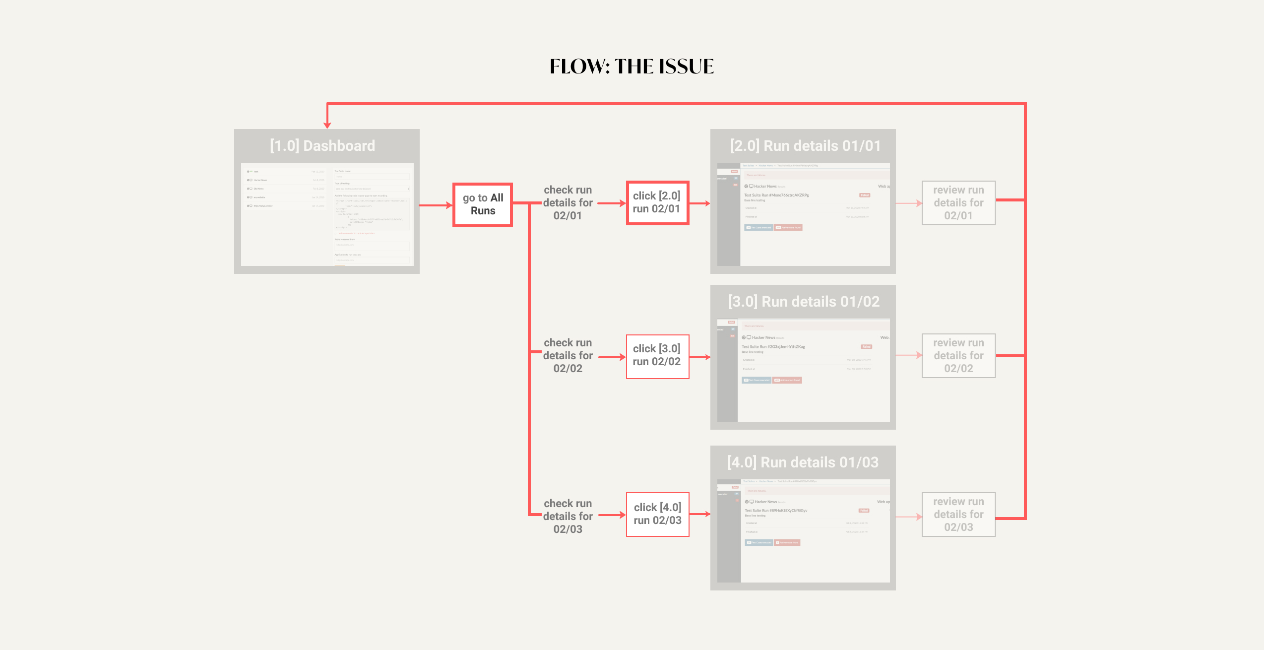
Users must switch pages constantly to view this information within the same test suite
Problem: Users must switch pages constantly to view information of the same test suite
Solution
All test runs are moved to the same page and separated by the run date (added a day picker & tabs for the last 5 runs).
With an understanding of the architectural issues of the existing design, I created a new architecture
A mockup of the final proposed solution (Checking a specific test run)
Pain Point 3
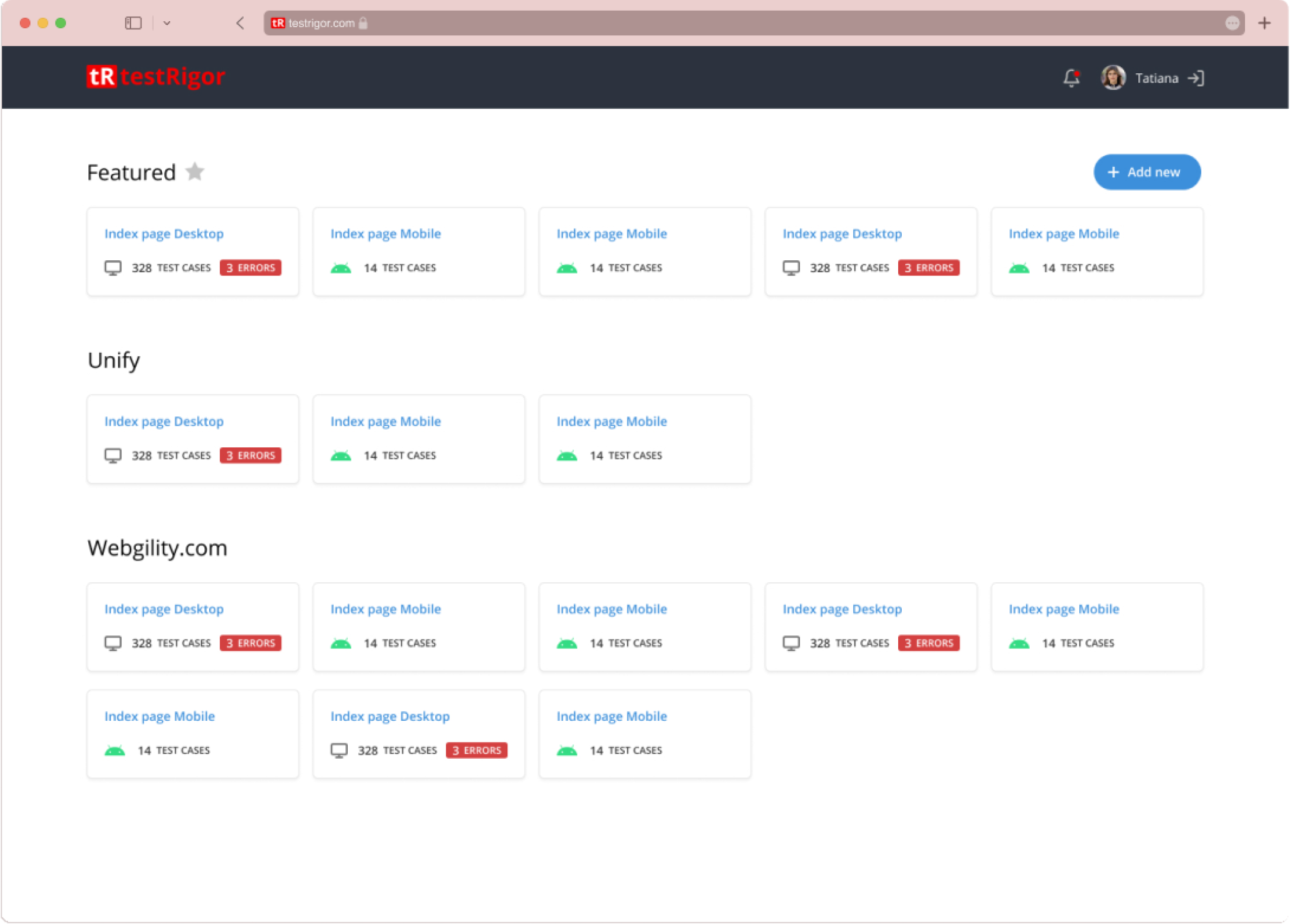
Users wanted easy awareness of test suites with failed runs.
The old flow required checking each test suite individually.
Users wanted to be notified about new finished (passed or failed) runs.
Solution
Create an overview page highlighting suites with failed runs. Implement a notification feature.
Solution
Reviewers have spoken well of the dashboard design. The application has been described as “simple”, “straightforward”, “smooth” and “easy to use”. Most importantly, the interaction was never confusing.
This project was an interesting challenge. Making the right compromises to best deal with constraints was definitely the theme of this project (as expected with an early-stage startup).
client’s appraisal of the revised dashboard
«We were pleasantly surprised at how powerful the product was, and then testRigor made UI and Reporting updates that matched the prowess of the backend.»
Measuring Success
37 %
Increase in SETUP
COMPLETION RATE
