How might we promote new business with recommendations from people you can trust?
Role
Design Strategy, Information Architecture, Mobile And Web Interaction Design, Prototyping, User Research, Visual Design
Timeline
Working In-House At Everfave
The Context
Everfave, Inc. operates a social and mobile referral platform in the United States. Its platform enables users to refer businesses to their friends.
THE CONTEXT
I joined the company when it was just an idea. Everfave needed critical design assistance to transition from rough wireframes to a marketable product. How would we help Everfave move forward to a full-fledged product on a limited budget?
The problem
Everfave wanted to become the largest database of people’s favorite things (like Yelp), a platform for users to get rewards and deals (like Groupon), and a social media platform (like Facebook). But how would Everfave encourage users to share their faves?
Research
I did discovery research that showed that:
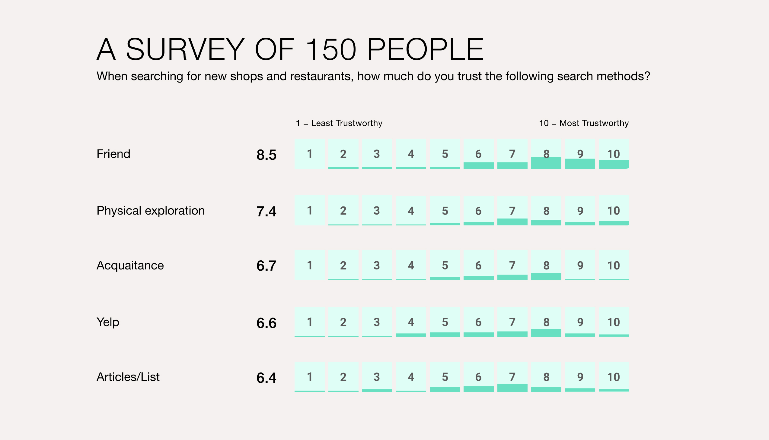
Each person has a database of great places in their heads. Each person has friends with their own sets of unique databases. People trust friends’ judgements, but exchanging recommendations takes too much effort from both sides. Because of this disconnect, people place their trust in review sites like Yelp or Foursquare. While review sites provide a large quantity of feedback, the demographics and specific tastes of reviewers are unknown. A person looking up reviews doesn’t know if the people who left reviews have different priorities, personalities, or preferences.
Usability testing
The iconography confuses people. The faves, bucket list, and filters icons are not easily distinguished.The navigation is not intuitive. There is no way to set preferences. Places are displayed as an endless, random stream.
The Design Process
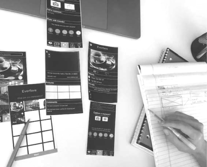
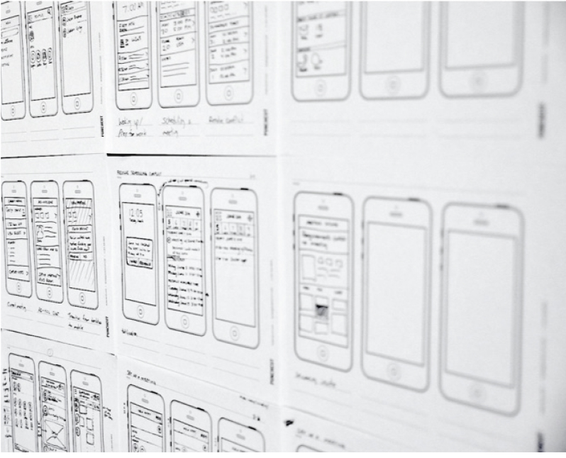
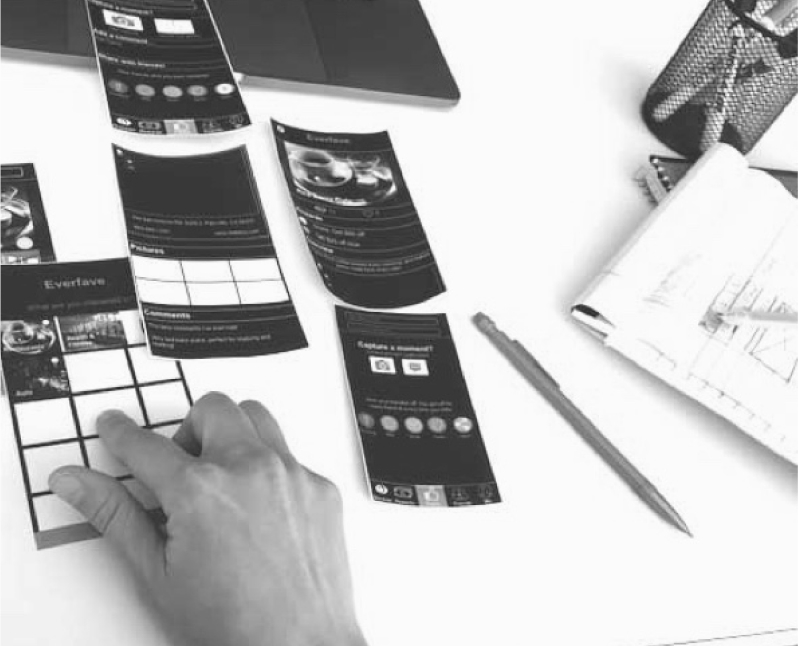
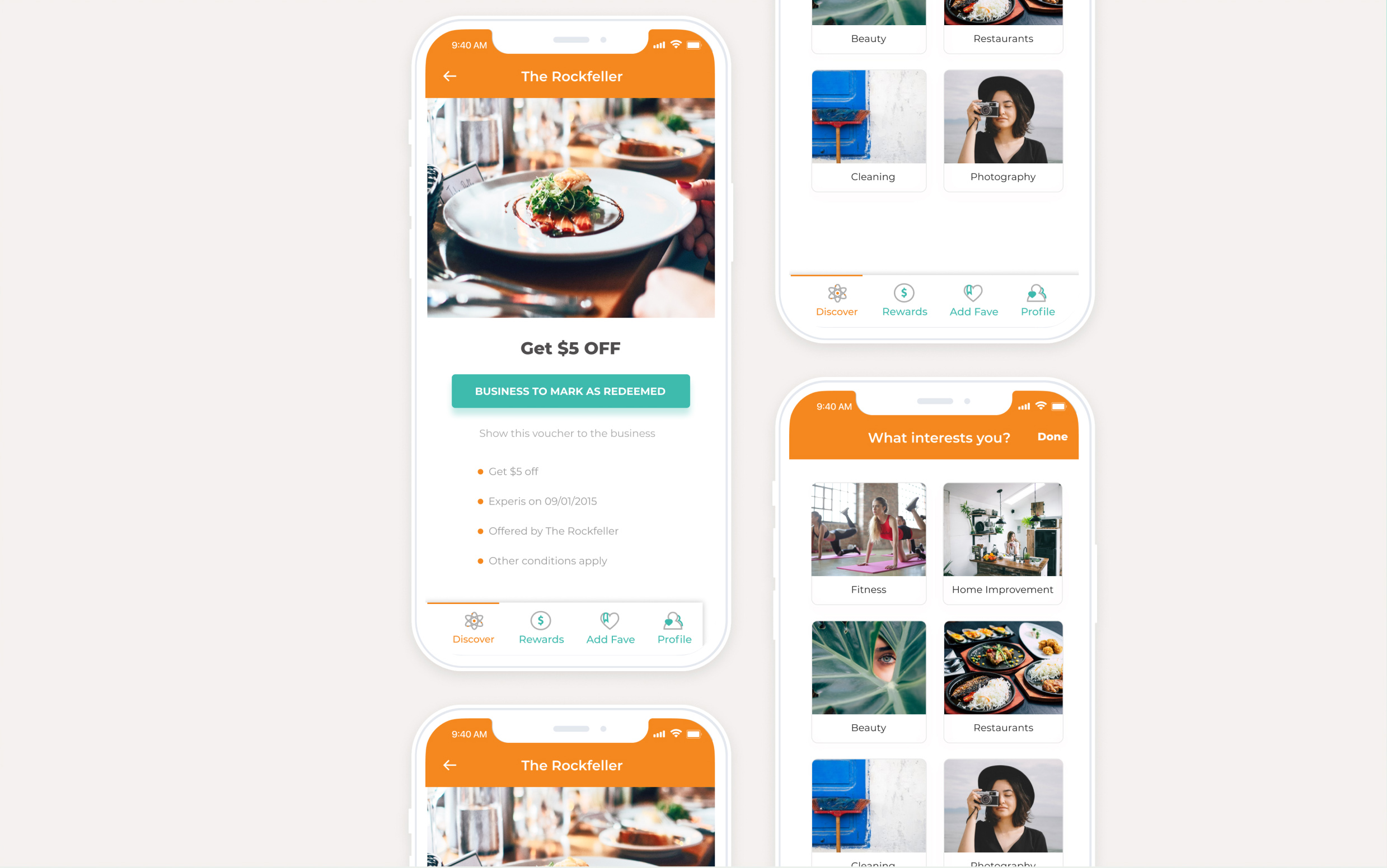
I created several different iterations of prototypes, ranging from paper to high-fidelity, for research to assess the use cases for a potential mobile app.
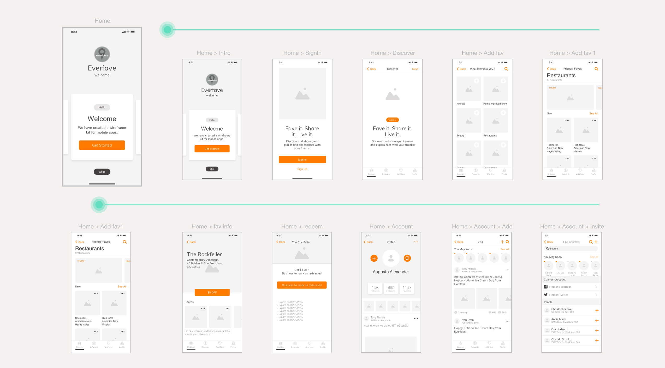
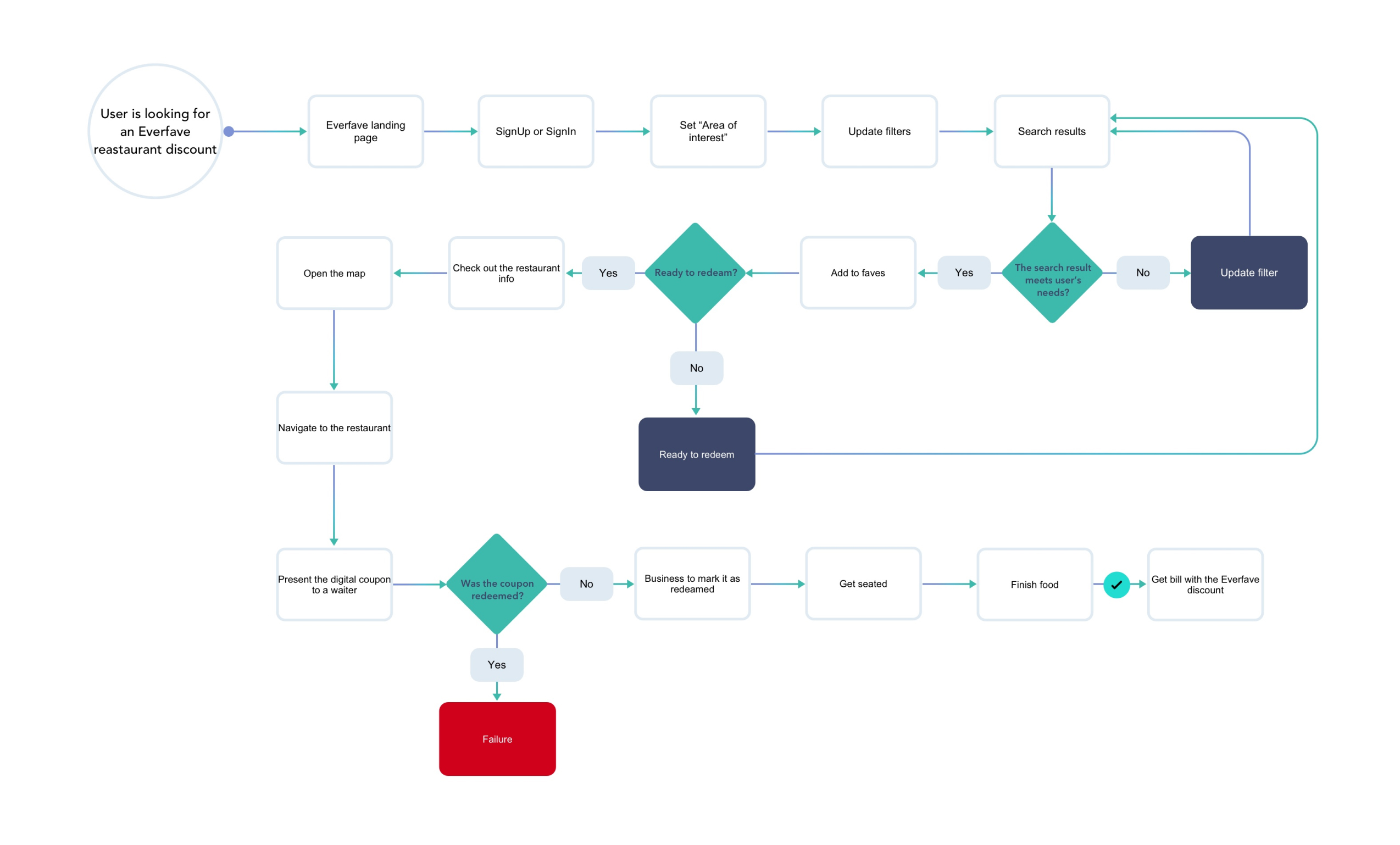
After building the new architecture, I created a low-fidelity prototype, user flows, and design mockups based off the prototype.
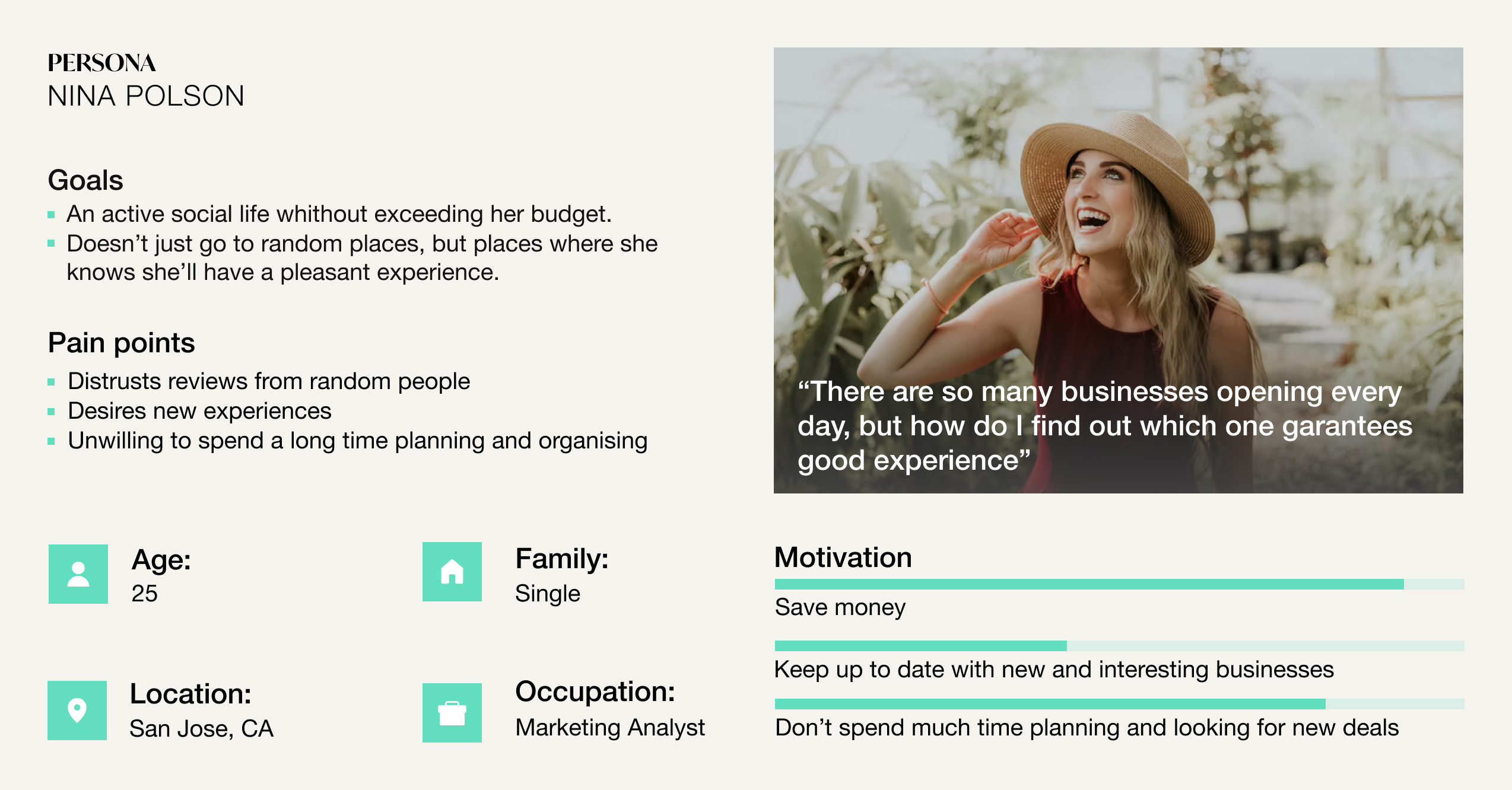
The prototypes acted as talking points in our research for us to understand the users’ goals/constraints/motivation with the options the app provided (a mix of Yelp/Groupon/Facebook). As a result, we gathered more diverse research via ethnography, interviewing, and usability testing to better understand our users.
KEY INSIGHTS
People don’t want to be used or seen as promotional vehicles. People like discounts as long as they don’t feel like they have to work for them. Most people don’t write reviews because it’s too time-consuming. Friends’ recommendations are valued over blind reviews. Most people validate a friend’s recommendation by checking online reviews afterwards.
ANALYZING THE CURRENT DESIGN FROM THE USER’S PERSPECTIVE.
People don’t want to be used or seen as promotional vehicles. People like discounts as long as they don’t feel like they have to work for them. Most people don’t write reviews because it’s too time-consuming. Friends’ recommendations are valued over blind reviews. Most people validate a friend’s recommendation by checking online reviews afterwards.
DESIGNING A NEW PRODUCT ITERATION.
Based on the new data, I started questioning the assumption that all three major functionalities should be equally presented in the app, with a main focus on social networking. It resulted in a bloated, not well thought-out product. I insisted on taking a step back to see how we could better align business goals and user needs.
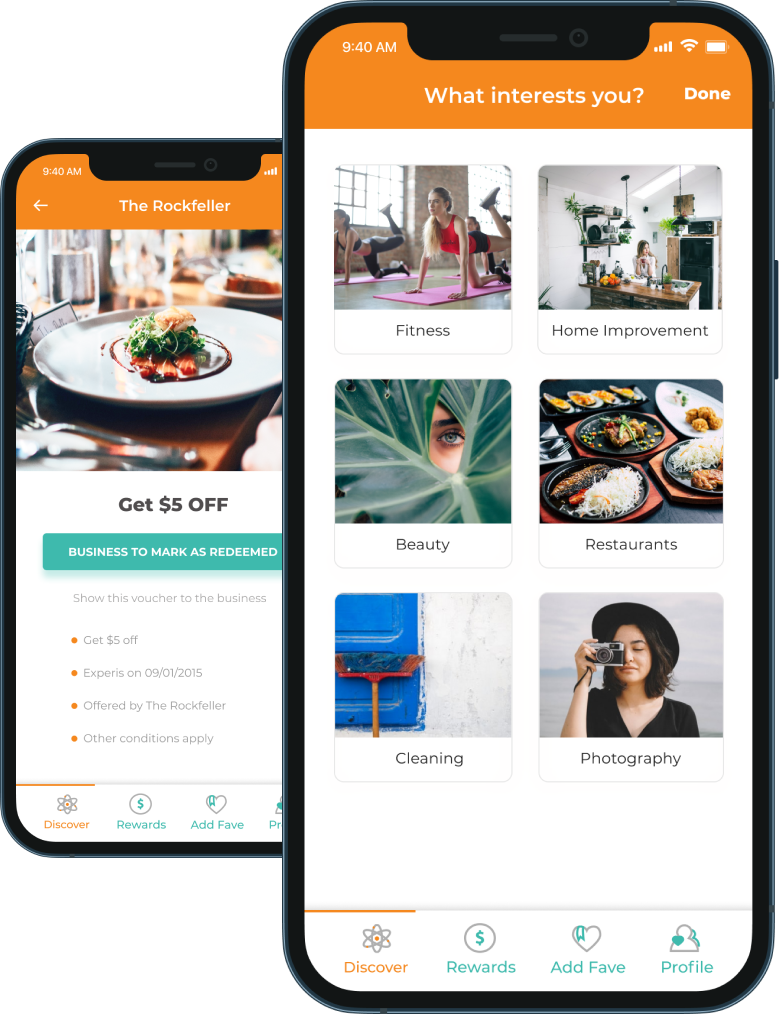
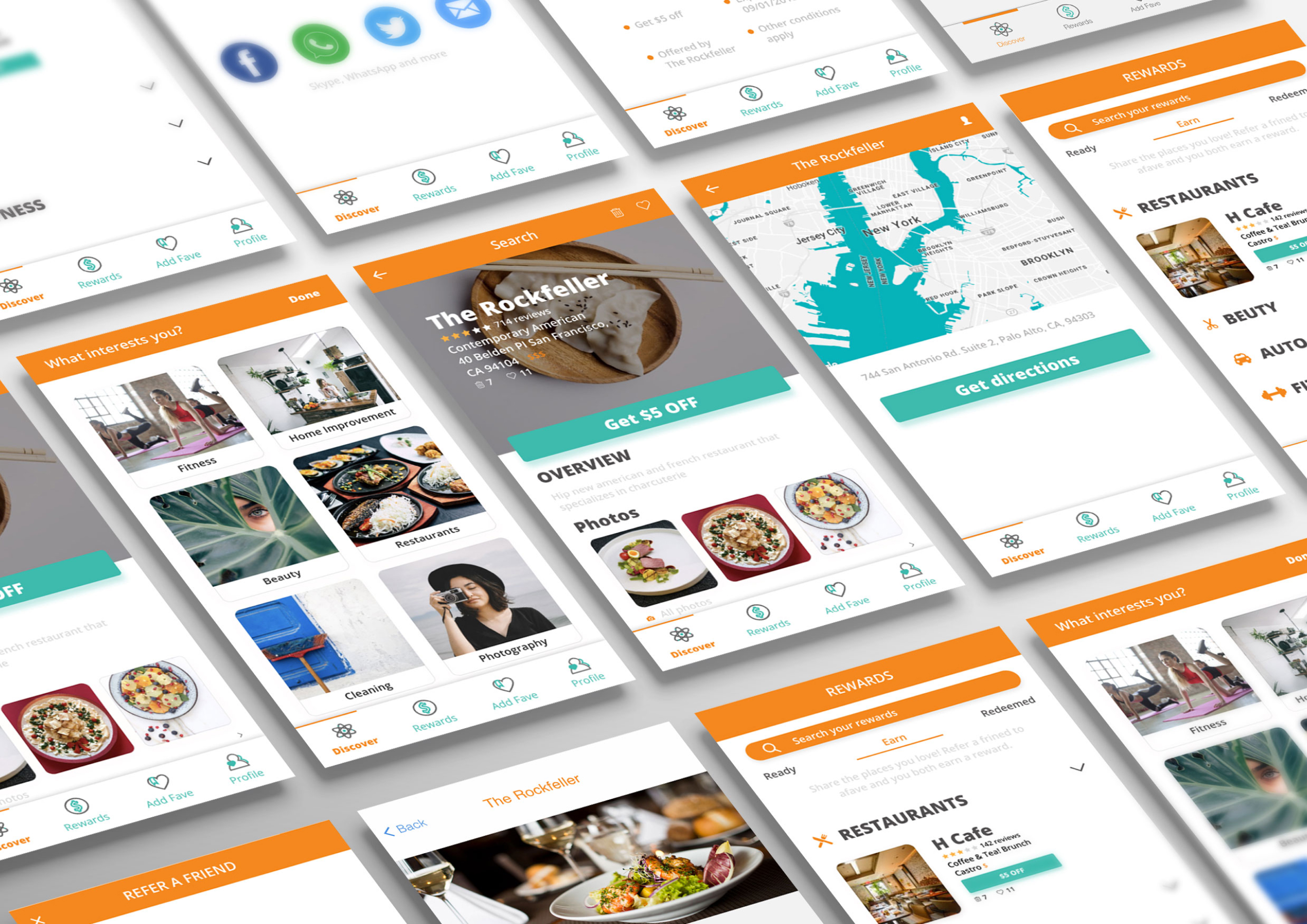
The research helped orient the product from Facebook’s social networking model to Groupon’s discount-focused model. The research also green-lit development of iOS and Android mobile apps.
After building the new architecture, I created a low-fidelity prototype, user flows, and design mockups based off the prototype.
THE RESULT AND REFLECTION
The design work I accomplished shows itself in the product. By taking a systematic design approach, we aligned user needs and business goals. The company was named “Top 10 most viewed startups in the U.S.” by Look Sharp and won the Silicon Valley Entrepreneurs Innovation Award. Everfave secured its first VC funding in 2016.
